
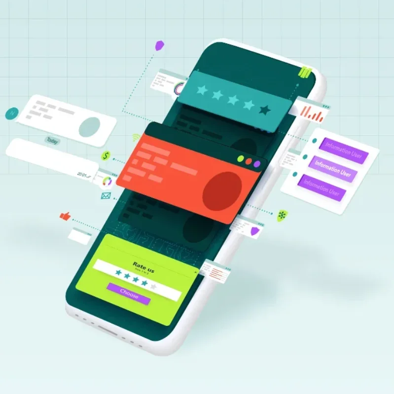
On the websites we maintain, between 62 and 78 per cent of sessions come from a phone — and for restaurants and clinics it is at the top of that range. Mobile-first is therefore not a design philosophy. It is simply designing for the majority, and letting the desktop version be the adaptation instead of the original.
Who is actually on the other end
Before any layout decision, it helps to picture the real visitor rather than the imagined one. Across our client projects the mobile visitor is, overwhelmingly, in one of three situations:
- Deciding right now. They are near your restaurant, in a waiting room, or comparing two clinics in a phone browser with four other tabs open. They will give the page seconds, not minutes.
- Looking for one specific fact. Opening hours. Whether you do that treatment. The price. Whether you are open on Sunday. Everything else on the page is an obstacle between them and that fact.
- Doing something else at the same time. Walking, queuing, talking, holding a child. One hand, one thumb, imperfect attention, possibly bright sunlight.
Designing for that person is a constraint, and constraints are useful. If a page works for someone distracted, outdoors and in a hurry, it also works beautifully for someone relaxed at a desk. The reverse is not true, which is the entire argument for mobile-first.
Start with the small screen, honestly
"Mobile-first" is often claimed and rarely practised. The tell is the order of work: if the desktop layout was designed first and the mobile one derived from it afterwards, the site is desktop-first no matter what the proposal document says.
Doing it properly means the first artboard is 360 pixels wide, the first prototype the client sees is on their own phone, and the desktop layout is designed afterwards by asking "we now have more room — what deserves it?" That order produces different, better decisions. Content gets prioritised because it must; on a wide screen everything fits, so nothing is ever cut.
The one-thumb test
Hold your phone in one hand, at arm's length, outdoors. Can you complete the main action — call, book, find the address — without changing grip, zooming, or squinting? If not, the design is not finished, however good it looks on a laptop.
Layout rules that survive contact with real devices
The thumb zone
On a phone held in one hand, the bottom half of the screen is comfortable, the top corners are not. Modern devices are tall enough that the top-right corner is genuinely hard to reach. So primary actions belong low or within easy reach — a sticky call button at the bottom outperforms a phone number in the top-right header, every single time we have measured it.
Touch targets
The practical minimum for a tappable element is 44 by 44 CSS pixels, with at least 8 pixels of separation from its neighbours. Undersized targets do not merely annoy — they produce mis-taps, and a mis-tap on a mobile menu often means a bounce.
Type and contrast
| Element | Minimum on mobile | Why |
|---|---|---|
| Body text | 16 px | Below this, iOS zooms form fields automatically |
| Line height | 1.5 | Readability at arm's length in motion |
| Line length | 45–75 characters | Longer lines lose the reader's place |
| Text contrast | 4.5:1 | Legibility in direct sunlight |
| Tap target | 44 × 44 px | Average adult fingertip |
One column, and mean it
Side-by-side content below 700 pixels is nearly always a compromise. Stack it, and decide deliberately what comes first — because on a phone, "above" means "before", and the order is the hierarchy.
Navigation that does not hide the answer
The hamburger menu is not the villain it is sometimes made out to be, but it does bury everything behind it, so what you leave outside it matters enormously.
- Keep the two highest-value actions permanently visible — usually Call and Menu, or Call and Book
- Label the toggle, or at least give it an accessible name; a bare icon is measurably slower to find
- Open the menu instantly, with no animation longer than 300 ms
- Make the whole row tappable, not just the text of the link
- Show the current page, so people know where they are after scrolling
- Close on selection, and restore scroll position on the way back
For sites with more than about fifteen pages, add search. Below that, a good structure beats a search box that returns three results.
Forms on a phone: fewer fields, right keyboards
Form completion on mobile is roughly half of desktop for the same form. Most of that gap is self-inflicted and recoverable.
- Cut fields to what you genuinely need to reply. Every removed field measurably raises completion. Company name, postcode and "how did you hear about us" can wait for the conversation.
- Use the right input type.
type="tel"brings up a number pad,type="email"an e-mail keyboard. Free, instant improvement. - Add autocomplete attributes so the browser can fill name, e-mail and phone in one tap.
- Label above the field, never inside it. Placeholder-only labels disappear exactly when the user needs them.
- Validate on blur, not on every keystroke. Being told an e-mail is invalid while typing the third character is hostile.
- Keep errors next to the field and never clear what was already entered.
- Confirm clearly. A visible success state prevents the double submission that fills your inbox with duplicates.
Mobile performance is part of mobile design
A layout that is perfect at 360 pixels but arrives after six seconds has failed at mobile design, not at performance. On a phone the two are the same discipline.
- Serve phone-sized images to phones with
srcset; do not ship a desktop hero to a 360-pixel screen - Reserve space for images and embeds so the layout never jumps mid-read
- Avoid full-screen autoplay video on mobile — it is expensive in data and in battery, and it is muted anyway
- Keep total JavaScript small; mid-range phones parse code far more slowly than laptops
- Test on a real device that is three years old, not on this year's flagship
Every project we deliver is checked on a physical mid-range Android handset. Emulators get the layout right and the feel wrong — scroll smoothness, tap latency and font rendering only tell the truth on real hardware.
A test pass you can run yourself in twenty minutes
Before signing off any page, we walk through this list on an actual phone. It catches the overwhelming majority of real problems:
- Can I complete the main action with one thumb, without zooming?
- Is the phone number tappable and does it dial the right number?
- Does the address open in a maps app in one tap?
- Are opening hours visible without opening a menu?
- Does anything overflow horizontally? (Scroll sideways on every page — this is the single most common bug.)
- Does the sticky header eat too much of a short screen?
- Does the form submit successfully, and does the confirmation stay visible?
- Is any text below 16 pixels, or any contrast below 4.5:1?
- Does everything still work in landscape?
- Does it hold together at 200% browser zoom?
And then, the desktop version
Designing the desktop layout last is not a downgrade — it is where the extra space finally has a purpose. With the mobile version settled, the wide layout becomes a set of clear questions: what benefits from being side by side, where does a wider image add meaning, what secondary information can now be visible instead of hidden?
The result tends to be calmer than a desktop-first design, because everything on the page has already survived a much harsher space constraint. Nothing is there simply because there was room for it.
Questions people ask about this
Across the small business sites we maintain, between 62 and 78 per cent of sessions come from phones. Restaurants, clinics and anything discovered through maps sit at the top of that range; B2B and technical catalogues sit lower, sometimes near 50 per cent.
No. Responsive means the layout adapts to the screen. Mobile-first means the small screen was designed first and given priority in every trade-off. A responsive site designed on desktop often ends up with a mobile version that technically fits but buries the things mobile visitors came for.
Almost never. A separate m-dot site doubles maintenance and splits your search signals, and an app requires people to install it before they can use it — which most will not do for a business they are still evaluating. One well-built responsive site serves both.
44 by 44 CSS pixels, with at least 8 pixels between adjacent targets. This is the accessibility guideline and it matches the average adult fingertip. Smaller targets produce mis-taps, which produce bounces.
Usually because browser device emulation reproduces the viewport but not the device. Real phones differ in font rendering, scroll behaviour, tap latency, safe-area insets around notches, and how the address bar changes viewport height while scrolling. Always confirm on physical hardware.
The short version
- Design the 360-pixel screen first; derive the desktop layout from it, not the reverse
- Keep the two highest-value actions outside the hamburger menu, in the thumb zone
- 16 px body text, 44 px tap targets, 4.5:1 contrast — non-negotiable minimums
- Cut form fields to what you need to reply, and use the correct input types
- Serve phone-sized images and reserve space so nothing jumps while reading
- Test on a real three-year-old handset, outdoors, with one hand